# Clean out /var/cache/apt/archives apt-get clean # Fill it with all the .debs we need apt-get --reinstall -dy install $(dpkg --get-selections | grep '[[:space:]]install' | cut -f1)
DIR=$(mktemp -d -t info-XXXXXX) for deb in /var/cache/apt/archives/*.deb do # Move to working directory cd "$DIR" # Create DEBIAN directory mkdir -p DEBIAN # Extract control files dpkg-deb -e "$deb" # Extract file list, fixing up the leading ./ and turning / into /. dpkg-deb -c "$deb" | awk '{print $NF}' | cut -c2- | sed -e 's/^\/$/\/./' > DEBIAN/list # Figure out binary package name DEB=$(basename "$deb" | cut -d_ -f1) # Copy each control file into place cd DEBIAN for file in * do cp -a "$file" /var/lib/dpkg/info/"$DEB"."$file" done # Clean up cd .. rm -rf DEBIAN done rmdir "$DIR"
dpkg: warning: files list file for package 'python-apt-common' missing; assuming package has no files currently installed dpkg: warning: files list file for package 'zerofree' missing; assuming package has no files currently installed dpkg: warning: files list file for package 'aufs-tools' missing; assuming package has no files currently installed dpkg: warning: files list file for package 'libnpth0:amd64' missing; assuming package has no files currently installed dpkg: warning: files list file for package 'fdisk' missing; assuming package has no files currently installed dpkg: warning: files list file for package 'libhtml-tagset-perl' missing; assuming package has no files currently installed dpkg: warning: files list file for package 'iputils-ping' missing; assuming package has no files currently installed dpkg: warning: files list file for package 'ubuntu-advantage-tools' missing; assuming package has no files currently installed dpkg: warning: files list file for package 'libedit2:amd64' missing; assuming package has no files currently installed dpkg: warning: files list file for package 'python3-cryptography' missing; assuming package has no files currently installed dpkg: warning: files list file for package 'libpam-runtime' missing; assuming package has no files currently installed dpkg: warning: files list file for package 'vim-tiny' missing; assuming package has no files currently installed dpkg: warning: files list file for package 'libncurses5:amd64' missing; assuming package has no files currently installed dpkg: warning: files list file for package 'libtool' missing; assuming package has no files currently installed dpkg: warning: files list file for package 'libcom-err2:amd64' missing; assuming package has no files currently installed dpkg: warning: files list file for package 'libgomp1:amd64' missing; assuming package has no files currently installed dpkg: warning: files list file for package 'dmeventd' missing; assuming package has no files currently installed dpkg: warning: files list file for package 'libpgm-5.2-0:amd64' missing; assuming package has no files currently installed dpkg: warning: files list file for package 'libatomic1:amd64' missing; assuming package has no files currently installed dpkg: warning: files list file for package 'libpython3-stdlib:amd64' missing; assuming package has no files currently installed dpkg: warning: files list file for package 'liblxc1' missing; assuming package has no files currently installed
......
解决办法:
新建 dpkg-warning.txt 文件,并把上述提示全部拷贝到 该文件中:
1
vi dpkg-warning.txt
新建 dpkg-warning-fix.sh 文件,编辑内容:
1 2 3 4 5 6
#!/bin/bash
for package in $(cat dpkg-warning.txt | grep "dpkg: warning: files list file for package " | grep -Po "'[^']*'" | sed "s/'//g"); do apt install --reinstall "$package"; done
A Theme is accessed as a property of a Context and can be obtained from any object which is or has a context e.g. Activity, View or ViewGroup. These objects exist in a tree, where an Activity contains ViewGroups which contain Views etc. Specifying a theme at any level of this tree cascades to descendent nodes e.g. setting a theme on a ViewGroup applies to all the Views within it (in contrast to styles which only apply to a single view).
Setting a theme at any level in this tree doesn’t replace the theme currently in effect, it overlays it. Consider the following Button which species a theme, but who’s parent also specifies a theme:
If an attribute is specified in both themes, then the most local “wins” i.e. those in Bar will be applied to the button. Any attributes specified in theme Foo but not specified in theme Bar will also be applied to the button.
Themes overlay each other
This might seem like a contrived example but this technique is extremely useful for styling subsections of an app with a different appearance such as a dark toolbar on an otherwise light screen, or this screen (from the Owl sample app) which has a largely pink theme but the bottom section showing related content has a blue theme:
A blue sub-section within a pink themed screen.
This can be achieved by setting a theme on the root of the blue section and it cascades to all views within it.
Overly Overlaid
As themes overlay any themes higher in the tree, it’s important to consider what your theme specifies to ensure that it doesn’t accidentally replace an attribute that you want to keep. For example, you may want to change the background color of a view (usually controlled by colorSurface) but nothing else i.e. you want to retain the rest of the current theme. For this we can use a technique known as theme overlays.
These are themes which are designed to, well, overlay another theme. They are as narrowly scoped as possible i.e. they only define (or inherit) as few attributes as possible. In fact, theme overlays often (but not always) have no parent e.g.:
Theme overlays are narrowly scoped themes, defining as few attributes as possible, designed to overlay another theme
By convention, we name these beginning with “ThemeOverlay”. There are a number of handy theme overlays provided by MDC (and AppCompat) that you can use to flip the color of a subsection of your app from light to dark:
ThemeOverlay.MaterialComponents.Dark
ThemeOverlay.MaterialComponents.Light
By definition, theme overlays don’t specify a number of things and shouldn’t be used in isolation e.g. as the theme of your activity. In fact you can think of 2 “types” of theme you can use in your app:
“Full” themes. These specify everything you’d need for a screen. They inherit from another “full” theme like Theme.MaterialComponents and should be used to theme an Activity.
Theme overlays. Only ever intended to be applied over a full theme, i.e. should not be used in isolation as likely won’t specify important and necessary things.
Ever-present
There’s always a theme in effect, even if you don’t specify one anywhere in your app you’ll inherit a default theme. As such the example above was a simplification and you should never use a full theme within a View and instead use theme overlays:
These overlays won’t exist in isolation but will themselves be overlaid on the theme of the enclosing Activity.
Cost : Benefit
Using Themes has a run-time cost; each time that you declare an android:theme, you’re creating a new ContextThemeWrapper, which allocates new Theme and Resources instances. It also introduces more levels of styling indirection to be resolved. Be wary of using themes too liberally, especially in repeated situations such as RecyclerView item layouts or profile to monitor their impact.
Use in Context
We said that a Theme is associated with a Context — this means that if you’re using a Context to retrieve a resource in code, then be careful that you use the rightContext. For example, somewhere in your code you may retrieve a Drawable:
If the drawable references a theme attribute (which all drawables can do from API 21+, and VectorDrawables can do from API 14+ via Jetpack) then you should ensure you use the right Context to load the Drawable. If you don’t you might be frustrated when trying to apply a theme to a sub-hierarchy and wondering why your Drawable isn’t respecting it. For example if you use a Fragment or Activity’s Context to load the Drawable, this won’t respect themes applied lower down in the tree. Instead use the Contextclosest to where the resource will be used:
We’ve talked about themes and contexts existing in a tree: Activity > ViewGroup > View etc. It can be tempting to extend this mental model to include the Application class, after all you can specify a theme on the <application> tag in your manifest. Don’t be fooled by this!!
The ApplicationContext does not retain any theme information, the theme that you can set in your manifest is merely used as a fallback for any Activity which doesn’t explicitly set a theme. As such you should never use the ApplicationContext to load resources which might vary by theme (like drawables or colors) or to resolve theme attributes.
Never use the*Application**Context*to load themable resources
This is also why we specify a “full” theme for an Activity and structure these to extend from any application wide theme — an <activity>’s theme isn’t overlaid over the <application>’s.
Build up
Hopefully this post has explained how themes overlay ancestors in a tree and how this behavior can be useful when styling our apps. Use the android:theme tag to theme sections of your layout and use theme overlays to only adjust the attributes you need. Be mindful of using the right theme and context to load resources and be wary of the application context!
In the previous posts in this series on Android styling, we looked at the difference between themes and styles and why it’s a good idea to factor out things that you wish to vary by theme and common theme attributes to use:
This enables us to create fewer layouts or styles, isolating changes within a theme. In practice, you largely want to vary colors by theme and as such you should always* refer to colors via theme attributes.
Always* refer to colors via theme attributes
That means you can consider code like this to be a smell:
Even if you’re not currently supporting alternate themes (what–no dark theme??), I’d recommend following this approach as it’ll make adopting theming much easier.
Qualified Colors?
You can vary colors by providing alternate values in different configurations (e.g. @color/foo defined in both res/**values**/colors.xml and an alternate value set in res/**values-night**/colors.xml) but I’d recommend using theme attributes instead.
Varying at the color layer forces you to give semantic names to colors i.e. you likely wouldn’t name a color @color/white and provide a dark variant in the -night configuration — that would be pretty confusing. Instead you might be tempted to use a semantic name, like @color/background. The problem with this is that it combines both the declaration of the color and providing the value. As such it gives no indication that this can or will vary by theme.
Varying @colors can also encourage you to create more colors. If a different situation calls for a new semantically named color with the same value (i.e. not a background but should be the same color), then you still need to create a new entry in your colors file.
By using a theme attribute we separate the declaration of semantic colors from providing their values and make call-sites clearer that the color will vary by theme (as they use the ?attr/ syntax). Keeping your color declarations to literally named values encourages you to define a palette of colors used by your app and vary them at the theme level, keeping your colors file small and maintainable.
Define a palette of colors used by your app and vary them at the theme level
The added benefit of this approach is that layouts/styles referring to these colors become more reusable. Because themes can be overlaid or varied, the indirection means you don’t need to create alternate layouts or styles just to vary some colors — you can use the same layouts with a different theme.
Always?
I placed an asterix on “always* refer to colors via theme attributes” because there may be occasions where you explicitly don’t want to vary a color by theme. For example, the Material Design guidelines call out occasions where you may wish to use the same brand color in both light and dark themes.
In these rare cases, it’s perfectly valid to refer directly to a color resource:
This might be valid if primary_20 is a ColorStateList which itself refers to theme attributes for the color values (see below). While commonly used to provide different colors in different states (pressed, disabled etc) ColorStateLists have another capability that can be useful for theming. They let you specify an alpha value to be applied to a color:
This kind of single-item-ColorStateList (i.e. only supplying a single, default color, not different colors per state) helps reduce the number of color resources that you need to maintain. That is rather than defining a new color resource that manually sets an alpha value on your primary color (per configuration!) instead this alters whatever colorPrimary is in the current theme. If your primary color changes you only need to update it in a single place, not hunting down all instances of where it has been tweaked.
While useful, there are some caveats to this technique to be aware of.
\1. If the specified color also has an alpha value, then the alphas are combined e.g. applying 50% alpha to 50% opaque white would yield 25% white:
For this reason, it’s preferable to specify theme colors as fully opaque and use ColorStateLists to modify their alphas.
\2. The alpha component was only added in API 23 so if your min sdk is lower than this, be sure to use AppCompatResources.getColorStateList which backports this behavior (and always use the android:alpha namespace, never the app:alpha namespace).
\3. Often we use a shorthand to set a color as a drawable e.g.
A View’s background is a drawable, this shorthand coerces the given color to a ColorDrawable. However there is no way to convert a ColorStateList to a Drawable (before API 29 when ColorStateListDrawable was introduced to solve this issue). We can however work around this restriction:
Be sure that your background tint supports the states your view needs e.g. if it needs to change when disabled.
Enforcement
So you’re convinced that you should be using theme attributes and ColorStateLists, but how do you enforce this across your codebase or team? You can try to be vigilant during code reviews but this doesn’t scale well. A better approach is to rely on tooling to catch this. This article outlines how to add a lint check to look for literal color uses and could be extended to cover all advice in this article:
Using theme attributes and ColorStateLists to factor colors out to your theme makes your layouts and styles more flexible, promoting reuse and keeping your codebase lean and maintainable.
Join us in the next post where we’ll look more at using themes and how they interact:
In the previous article in this series on Android styling, we looked at the difference between themes and styles and how themes allow you to write more flexible styles and layouts which isolate changes:
Specifically we recommended using theme attributes to provide a point of indirection to resources, so that you can vary them (e.g. in dark theme). That is, if you find yourself writing a direct resource reference (or worse yet, a hardcoded value 😱) in a layout or style, consider if you should use a theme attribute instead.
But what theme attributes are available to use? This post highlights the common ones that you should know about; those that come from Material, AppCompat or the platform. This is not a complete list (for that I’d recommend browsing the attrs files linked below where they are defined) but these are the attributes that I use all the time.
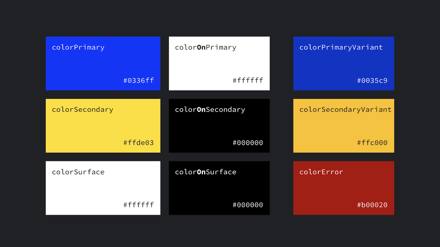
?attr/colorPrimary The primary branding color for the app.
?attr/colorSecondary The secondary branding color for the app, usually a bright complement to the primary branding color.
?attr/colorOn[Primary, Secondary, Surface etc] A color which contrasts against the named color.
?attr/color[Primary, Secondary]Variant An alternate shade of the given color.
?attr/colorSurface A color for surfaces of components, such as cards, sheets, and menus.
?android:attr/colorBackground The background for the screen.
?attr/colorPrimarySurface switches between colorPrimary in the Light themes, colorSurface in the Dark theme.
?attr/colorError A color for displaying errors.
Other handy colors:
?attr/colorControlNormal The color applied to icons/controls in their normal state.
?attr/colorControlActivated The color applied to icons/controls in their activated state (e.g. checked).
?attr/colorControlHighlight The color applied to control highlights (e.g. ripples, list selectors).
?android:attr/textColorPrimary The most prominent text color.
?android:attr/textColorSecondary Secondary text color.
Dimens
?attr/listPreferredItemHeight Standard (min) height for list items.
?attr/actionBarSize The height of a toolbar.
Drawables
?attr/selectableItemBackground A ripple/highlight for interactive items (also handy for foregrounds!!)
?attr/selectableItemBackgroundBorderless An unbounded ripple.
?attr/dividerVertical A drawable that may be used as a vertical divider between visual elements.
?attr/dividerHorizontal A drawable that may be used as a horizontal divider between visual elements.
TextAppearances
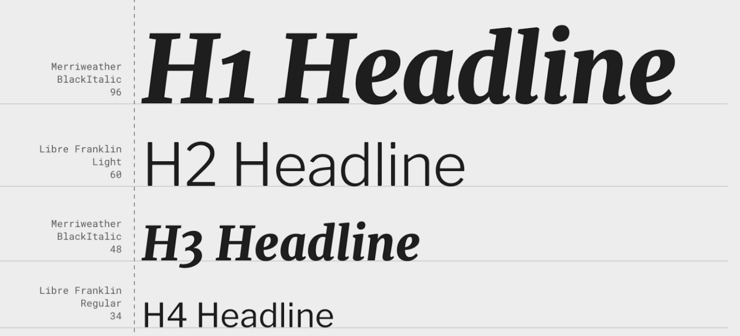
Material defines a type scale — a discrete set of text styles that you should use throughout your app, each of which is provided as a theme attribute which can be set as a textAppearance. Check out the Material type scale generator to help generate a scale for different fonts.
?attr/textAppearanceHeadline1 defaults to light 96sp text.
?attr/textAppearanceHeadline2 defaults to light 60sp text.
?attr/textAppearanceHeadline3 defaults to regular 48sp text.
?attr/textAppearanceHeadline4 defaults to regular 34sp text.
?attr/textAppearanceHeadline5 defaults to regular 24sp text.
?attr/textAppearanceHeadline6 defaults to medium 20sp text.
?attr/textAppearanceSubtitle1 defaults to regular 16sp text.
?attr/textAppearanceSubtitle2 defaults to medium 14sp text.
?attr/textAppearanceBody1 defaults to regular 16sp text.
?attr/textAppearanceBody2 defaults to regular 14sp text.
?attr/textAppearanceCaption defaults to regular 12sp text.
?attr/textAppearanceButton defaults to medium all caps 14sp text.
?attr/textAppearanceOverline defaults to regular all caps 10sp text.
Shape
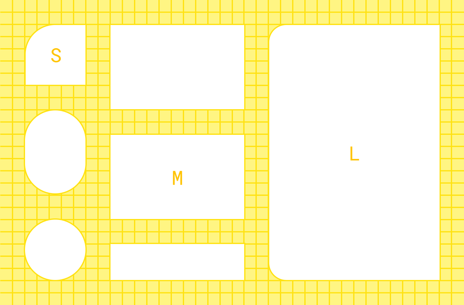
Material employs a shape system which is implemented as theme attrs for small, medium and large components. Note that if you’re setting a shape appearance on a custom component, you likely want to use a MaterialShapeDrawable as it’s background which understands and implements the shaping.
?attr/shapeAppearanceSmallComponent used for Buttons, Chips, Text Fields etc. Defaults to rounded 4dp corners.
?attr/shapeAppearanceMediumComponent used for Cards, Dialogs, Date Pickers etc. Defaults to rounded 4dp corners.
?attr/shapeAppearanceLargeComponent used for Bottom Sheets etc. Defaults to rounded 0dp corners (i.e. square!)
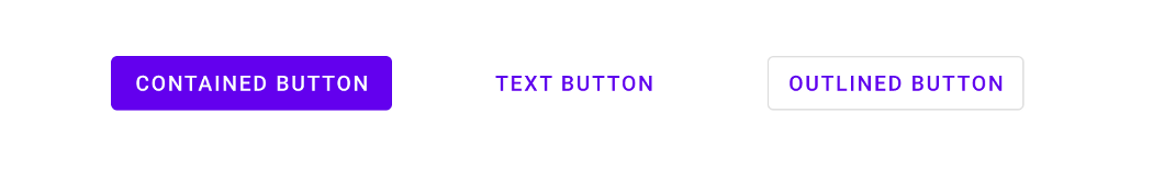
Button Styles
This might seem super specific, but Material defines three types of buttons: Contained, Text and Outlined. MDC offers theme attrs that you can use to set the style of a MaterialButton:
?attr/materialButtonStyle defaults to contained (or just omit the style).
?attr/borderlessButtonStyle for a text style button.
?attr/materialButtonOutlinedStyle for outlined style.
Floats
?android:attr/disabledAlpha Default disabled alpha for widgets.
?android:attr/primaryContentAlpha The alpha applied to the foreground elements.
?android:attr/secondaryContentAlpha The alpha applied to secondary elements.
App vs Android namespace
You might have noticed that some attributes are referenced by ?**android**:attr/foo and others just by ?attr/bar. This is because some are defined by the Android platform, and as such you need the android part to reference them by their namespace (just like with view attributes in layouts: android:id). Those without come from static libraries (i.e. AppCompat or MDC) which are compiled into your application, so don’t need the namespace (similar to how you might use app:baz in a layout). Some elements are defined both in the platform and in a library e.g. colorPrimary. In these cases, prefer the non-platform version, as this can be used on all API levels i.e. they’re duplicated in a library precisely to backport them. In these cases, I’ve listed the non-platform versions above.
prefer non-platform attributes which can be used on all API levels
More Resources
For a complete list of the theme attributes available to use, go to the source of truth:
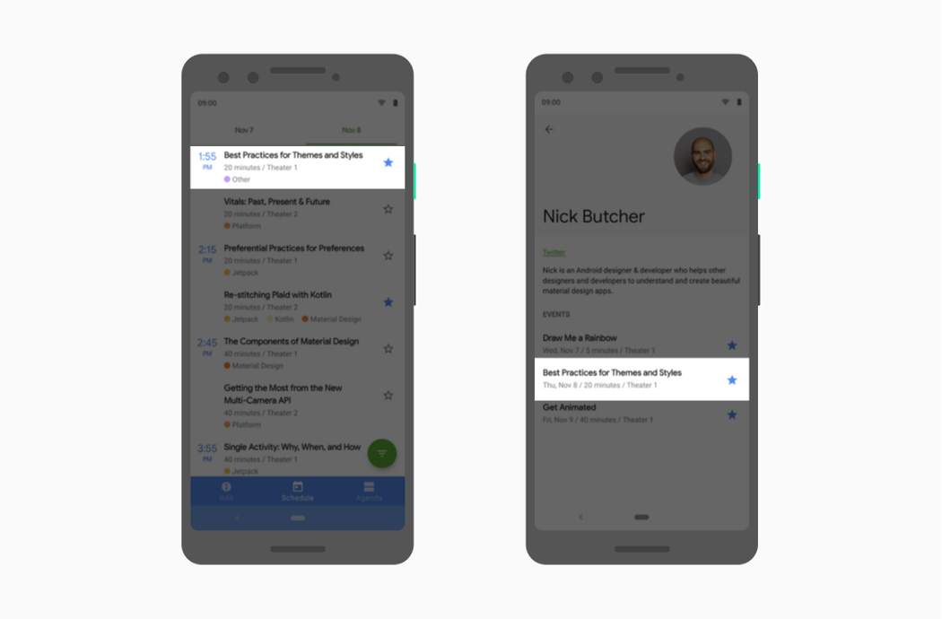
Sometimes there isn’t a theme attribute which abstracts something you’d like to vary by theme. No worries… create your own! Here’s an example from the Google I/O app which shows a list of conference sessions in two screens.
Two screens listing conference sessions
They’re largely similar but the left screen must leave space for the sticky time headers while the right screen does not. We implemented this by abstracting where to align items behind a theme attribute so that we can vary them by theme and use the same layout across two different screens:
Knowing what theme attributes are available, equips you to use them when writing your layouts, styles or drawables. Using theme attributes makes it much easier to support theming (like dark theme) and to write more flexible, maintainable code. For a deep dive on this, join us in our next post in this series:
The Android styling system offers a powerful way to specify your app’s visual design, but it can be easy to misuse. Proper use of it can make themes and styles easier to maintain, make branding updates less scary and make it straightforward to support dark modes. This is the first in a series of articles where Chris Banes and I will set out to demystify Android styling so that you can make stylish apps without pulling your hair out.
In this first article, I’ll take a look at the building blocks of the styling system: themes and styles.
Theme != Style
Both themes and styles use the same <style> syntax but serve very different purposes. You can think of both as key-value stores where the keys are attributes and the values are resources. Let’s take a look at each.
What’s in a style?
A style is a collection of view attribute values. You can think of a style as a Map<**view** attribute, resource>. That is the keys are all view attributes i.e. attributes that a widget declares and you might set in a layout file. Styles are specific to a single type of widget because different widgets support different sets of attributes:
Styles are a collection of view attributes; specific to a single type of widget
Views can only apply a single style — contrast this to other styling systems such as css on the web where components can set multiple css classes.
Scope
A style applied to a view only applies to that view, not to any of its children. For example, if you have a ViewGroup with three buttons, setting the InlineAction style on the ViewGroup will not apply that style to the buttons. The values provided by the style are combined with those set directly in the layout (resolved using the styling precedence order).
What’s a theme?
A theme is a collection of named resources which can be referenced later by styles, layouts etc. They provide semantic names to Android resources so you can refer to them later e.g. colorPrimary is a semantic name for a given color:
These named resources are known as theme attributes, so a theme is Map<**theme** attribute, resource>. Theme attributes are different from view attributes because they’re not properties specific to an individual view type but semantically named pointers to values which are applicable more broadly in an app. A theme provides concrete values for these named resources. In the example above the colorPrimary attribute specifies that the primary color for this theme is teal. By abstracting the resource with a theme, we can provide different concrete values (such as colorPrimary=orange) in different themes.
Themes are a collection of named resources, useful broadly across an app
A theme is similar to an interface. Programming to an interface allows you to decouple the public contract from the implementation allowing you to provide different implementations. Themes play a similar role; by writing our layouts and styles against theme attributes, we can use them under different themes, providing different concrete resources.
You can also set a theme in code by wrapping an existing Context with a ContextThemeWrapper which you could then use to inflate a layout etc.
The power of themes really comes from how you use them; you can build more flexible widgets by referencing theme attributes. Different themes provide concrete values at a later time. For example, you might wish to set a background color on a section of your view hierarchy:
Rather than setting a static color (#ffffff or a @color resource) we can delegate to the theme by using the ?attr/themeAttributeName syntax. This syntax means: query the theme for the value of this semantic attribute. This level of indirection allows us to provide different behavior (e.g. providing a different background color in light and dark themes) without having to create multiple layouts or styles which are mostly identical but for a few color variations. It isolates the elements that are changing within the theme.
Use the ?attr/themeAttributeName syntax to query the theme for the value of this semantic attribute
Scope
A Theme is accessed as a property of a Context and can be obtained from any object which is or has a Context e.g. Activity, View or ViewGroup. These objects exist in a tree, where an Activity contains ViewGroups which contain Views etc. Specifying a theme at any level of this tree cascades to descendent nodes e.g. setting a theme on a ViewGroup applies to all the Views within it (in contrast to styles which only apply to a single view).
1
2
3
4
5
6
<!-- Copyright 2019 Google LLC.
   SPDX-License-Identifier: Apache-2.0 -->
<ViewGroup …
  android:theme="@style/Theme.App.SomeTheme">
  <! - SomeTheme also applies to all child views. -->
</ViewGroup>
This can be extremely useful, say if you want a dark themed section of an otherwise light screen. Read more about this behavior here.
Note that this behavior only applies at layout inflation time. While Context offers a setTheme method, or Theme offers an applyStyle method, these need to be called before inflation. Setting a new theme or applying a style after inflation will not update existing views.
Separate Concerns
Understanding the different responsibilities and the interaction of styles and themes, helps to keep your styling resources more manageable.
For example, say you have a blue theme for your app, but some Pro screens get a fancy purple look and you want to provide dark themes with tweaked colors. If you tried to achieve this using only styles, you would have to create 4 styles for the permutations of Pro/non-Pro and light/dark. As styles are specific to a type of view (Button, Switch etc) you’d need to create these permutations for each view type in your app.
Exploding permutations of widgets/styles without theming
If instead we use styles and themes we can isolate the parts which alter by theme as theme attributes so we only need to define a single style per view type. For the above example we might define 4 themes which each provide different values for the colorPrimary theme attribute, which these styles then refer to and automatically reflect the correct value from the theme.
This approach might seem more complicated as you need to consider the interaction of styles and themes, but it has the benefit of isolating the parts that change per theme. So if your app rebrands from blue to orange, you only need to change this in a single place, not scattered throughout your styling. It also helps fight a proliferation of styles. Ideally you only have a small number of styles per view type. If you don’t take advantage of theming, it’s easy for your styles.xml file to get out of hand and explode with different variations of similar styles, which becomes a maintenance headache.
Join us in the next article where we explore some common theme attributes and how to create your own: