JetpackCompose 文档:
https://developer.android.google.cn/jetpack/compose/documentation?hl=zh-cn
官方教程:https://developer.android.google.cn/courses/pathways/compose?hl=zh-cn
compose 版本:https://developer.android.google.cn/jetpack/androidx/releases/compose?hl=zh-cn 更新比英文官网慢 /(ㄒoㄒ)/~~
implementation platform(‘androidx.compose:compose-bom:2023.05.00’)
官方示例:
https://github.com/android/nowinandroid
https://github.com/android/compose-samples
学习完基本知识点后,可以仔细研究一下官方的例子。
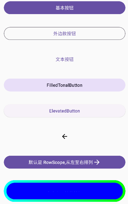
Modifier 修饰符
按文档的描述:
更改可组合项的大小、布局、行为和外观:Modifier.size(),Modifier.fillMaxWidth(),Modifier.fillMaxSize(),Modifier.padding()` 等,这是最常用的。
添加信息,如无障碍标签:
1 | Modifier.clickable( |
处理用户输入:
1 | Modifier.onFocusChanged(onFocusChanged: (FocusState) -> Unit) |
添加高级互动,如使元素可点击、可滚动、可拖动或可缩放:clickable {} 等
初始化 Modifer:
1 | val modifer = Modifier |
相关文档:
修饰符:https://developer.android.google.cn/jetpack/compose/modifiers?hl=zh-cn
修饰符列表:https://developer.android.google.cn/jetpack/compose/modifiers-list?hl=zh-cn
可组合函数
Jetpack Compose 是围绕可组合函数构建的。这些函数可让您以程序化方式定义应用的界面,只需描述应用界面的外观并提供数据依赖项,而不必关注界面的构建过程(初始化元素、将其附加到父项等)。如需创建可组合函数,只需将 @Composable 注解添加到函数名称中即可。
快捷输入 comp ,待出现提示,然后按回车键:
教程:https://developer.android.google.cn/jetpack/compose/tutorial?hl=zh-cn
Box 布局
相对布局,元素依次堆叠,默认在左上方(TopStart):
1 |
|
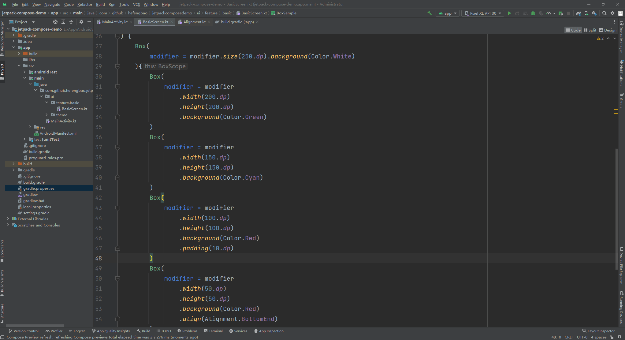
知识点:
1、modifier 链式调用,以及设置顺序
2、设置元素大小:size() 设定长度、高相同, width() 和 height() 分别设定长度和高度,还有 fillMaxWidth() 和 fillMaxHeight() 以及 fillMaxSize() ,则是自适应宽度和高度。
3、设置背景色 background()
4、Box 元素的位置设置用 align(),可用的参数有 Alignment.BottomEnd 、Alignment.TopStart 等十多种,可把鼠标指到 align(Alignment.BottomEnd) 括号内, Ctr + b 快捷键查看。
5、使用 @Preview 注解预览
Colum 布局
默认元素从上到下依次排列。
1 |
|
知识点:
1、可通过 verticalArrangement = Arrangement.spacedBy(8.dp) 设置每行之间的间隔
2、padding(8.dp) 设置上下左右相同的边距,padding(start = 8.dp, end = 4.dp, top = 10.dp, bottom = 6.dp) 上下左右需要设置那个就用那个,如果左右边距或上下边距相同则可以用 padding(horizontal = 16.dp, vertical = 0.dp)
Row 布局
默认元素从左到右依次排列。
1 |
|
知识点:
1、 horizontalArrangement = Arrangement.spacedBy(8.dp) 设置没列的间隔
2、 weight() 设置元素如何使用横向的剩余空间,比只有一个元素设置了 weight 属性,则它会占用横向的所有空间,又比如上面的代码中,蓝色快占 2/3, 青色块占 1/3。